Sentiment Analysis App
Domains Involved
- Mobile
- Sentiment Analysis
An analytics app that gave users access to up-to-the-minute Brazilian sentiment towards players, teams, and coaches during the 2014 World Cup.
Demonstrating IBM’s Potential for Design
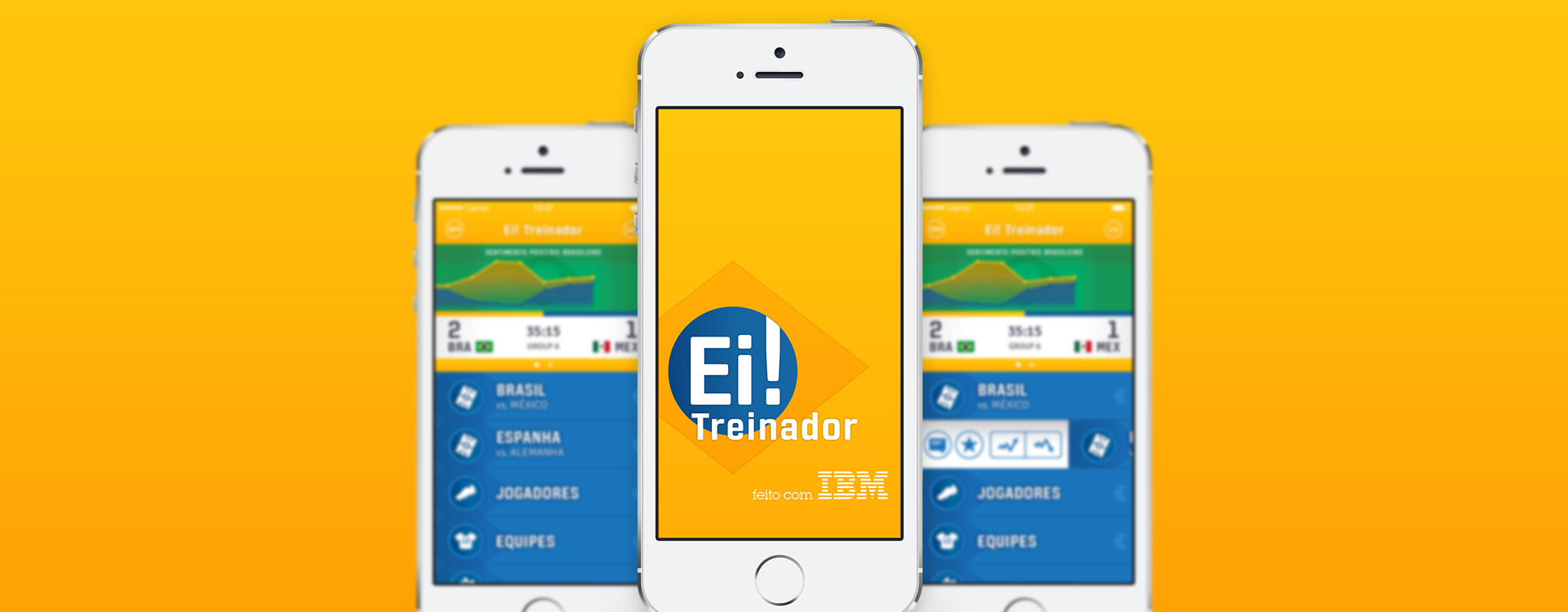
A showcase app from IBM’s Mobile Innovation Lab, the Ei! Treinador (Hey Coach! in Portuguese) was designed to exercise IBM’s Research technologies and its commitment to design and user experience. It was developed for use during the 2014 World Cup to show users real time sentiment analytics of matches as they took place.
Research developed an AI engine that could analyze text and determine the sentiment of the writer. In this case we set the technology loose on Twitter to analyze millions of Brazilian tweets. The result was a minute by minute view into how Brazilians felt about the teams, coaches, and players in the 2014.
Rapid Research, Design, & Development
Date-driven development is rarely the right choice for a great user experience that addresses user needs. Once we took the project on, however, the date for World Cup matches couldn’t exactly slip. The team of developers, designers, and product managers set themselves up side by side in a “war room” to deliver and support a functional app in just under three months.
The team dove in with stakeholder, competitive, and user research to define how football fans would use the app while watching the matches either in-stadium or second-screen. Design worked to help define not only the experience, but the technical execution and testing plan.
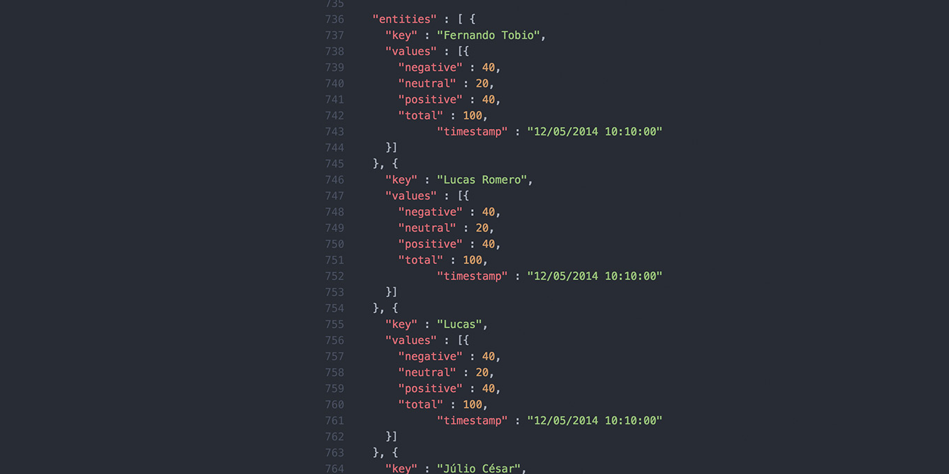
Design mapped designs to the API from match and sentiment data to help development understand where each data point came from and to make sure the designs respected the limitations of the API.
Giving the App Personality
Right from the start we wanted to inject personality into the app. Clever nods to the sport went into every crevice of interaction from the log in screen’s “GOOOOOOOOOOOOAAAAAAAL!” upon success to the loading screens rolling soccer ball. This served a number of purposes. For one, it brought fun from the start to what could otherwise have been a dry stats app. It also helped mask some of the application’s dependencies on an internet connection. The connectivity in the stadium or a misspelled search could pose issues when refreshing or loading screens. Rather than presenting the user with ERROR: SOMETHING’S BROKEN, we took the opportunity to inject a little humor to keep user interest. When the user encountered an error or timeout, the app displayed the message in a yellow card (a penalty card given for fouls in game for those not football familiar). The yellow card could then be “flung” away with a swipe to retry. It was very satisfying.
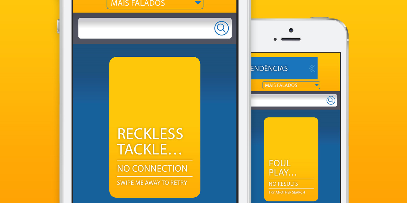
The app embraced football in every aspect. Timeout errors were shown as yellow cards the user could then fling offscreen to retry.
Right Place, Right Time Information
With thousands of players and dozens of teams and coaches across sixty-four matches, navigating data was a principle concern of the design. The hierarchy featured ongoing matches first, followed by trending data and past matches. More detail and data followed as a user followed the information architecture down from team to player and match. For the teams and players they cared most about, the app allowed them to add them to their dashboard to keep them within easy reach.
We knew that presenting only the relevant information would be the key to keeping the user focused on a match they were passionately screaming at while glancing at the app without frustrating them with information overload.
Another key feature of this sentiment-to-data comparison is the ability to scrub or jump to a point on the graph to see exactly what happened in the match to cause a rise or fall in sentiment. By scrubbing to points in time where a player’s sentiment dropped or spiked, they could see the correlating match events like goals and fouls to tie together cause and effect.
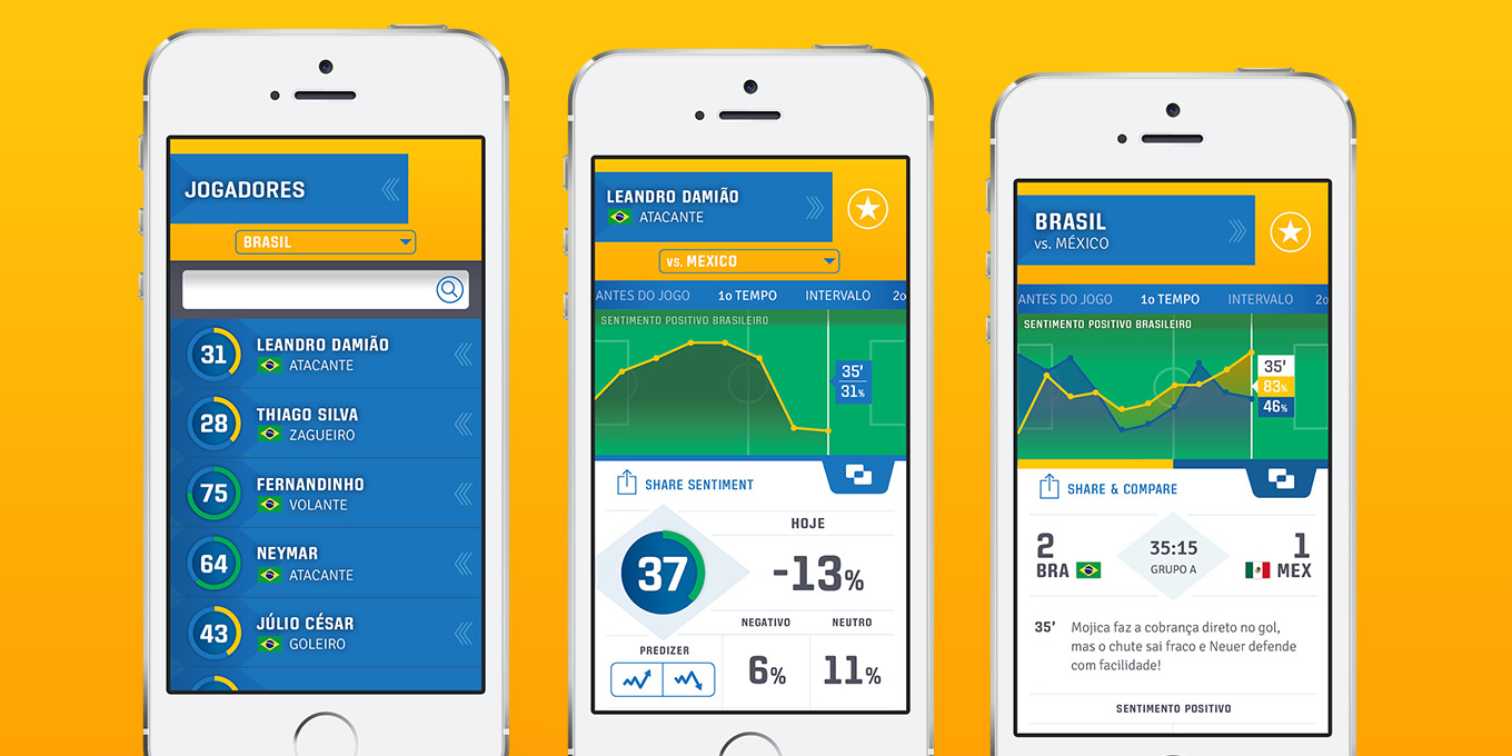
The structure of the app is set up to give users more detailed information as they navigate down to the topics they show interest in. This cuts down on visual noise and puts only the information users need on the screen, only when they need it.
I can’t go into further detail about this project publicly, but we can still talk about it.