Image Recognition App
Domains Involved
- App Personalization
- Image Recognition
- Mobile
- Motion Design
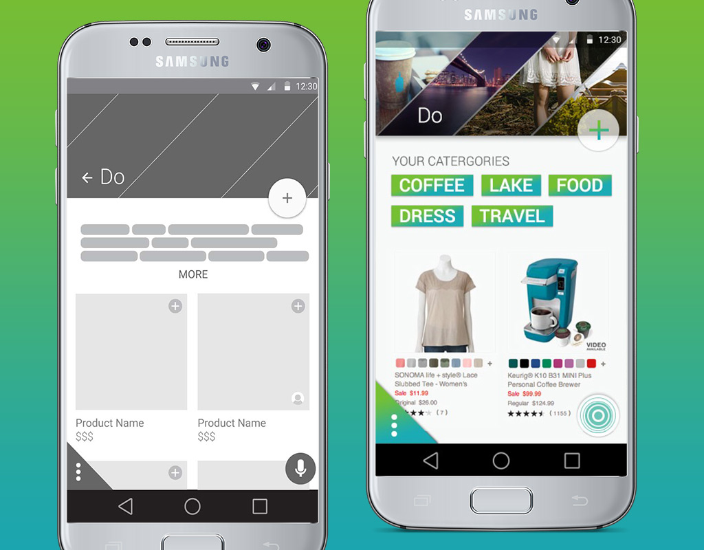
Using image recognition and in-app behavior to personalize suggestions, the Kohl’s & You mobile app allowed customers to more easily navigate Kohl’s catalog.
Reducing Friction in the Shopping Experience
An experience created within IBM’s Mobile Innovation Lab, the app started as a proof of concept for image recognition technology coming out of IBM Research. Kohl’s wanted to allow customers to take photos of clothes that they like and find matches and similar suggestions within Kohl’s own catalog.
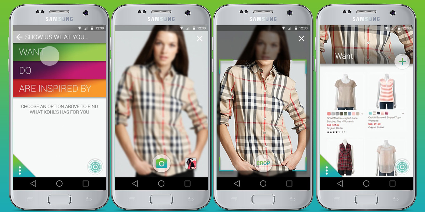
Design, development, and IBM Research worked side by side to understand the technologies’ limitations and respond to them within the design. Cropping the photo to the portion the customer was most interested in helped focus the AI’s analysis of the image.
Early Insights
Our first question wasn’t whether we could, but whether we should. We asked whether taking out a phone, lining up a shot, snapping a photo, and waiting on the results would truly be more efficient than opening the app and selecting Women’s ▹ Shirts ▹ Red. We found that it didn’t reduce time-to-product, but it did reduce cognitive load for users who might not share the same categorization Kohl’s catalog had assigned a product. It also got users in the ballpark of a collection of similar items that might have otherwise been scattered across separate categories.
Learning from Social Feeds to Personalize
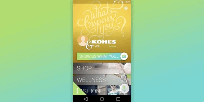
After some heuristic evaluation of how and when users captured images of interesting items, we quickly realized that on-device photo albums and social feeds were very likely to represent a user’s tastes. As a result, we decided to expand image sourcing to allow users to analyze social media to build a custom collection of products to browse.
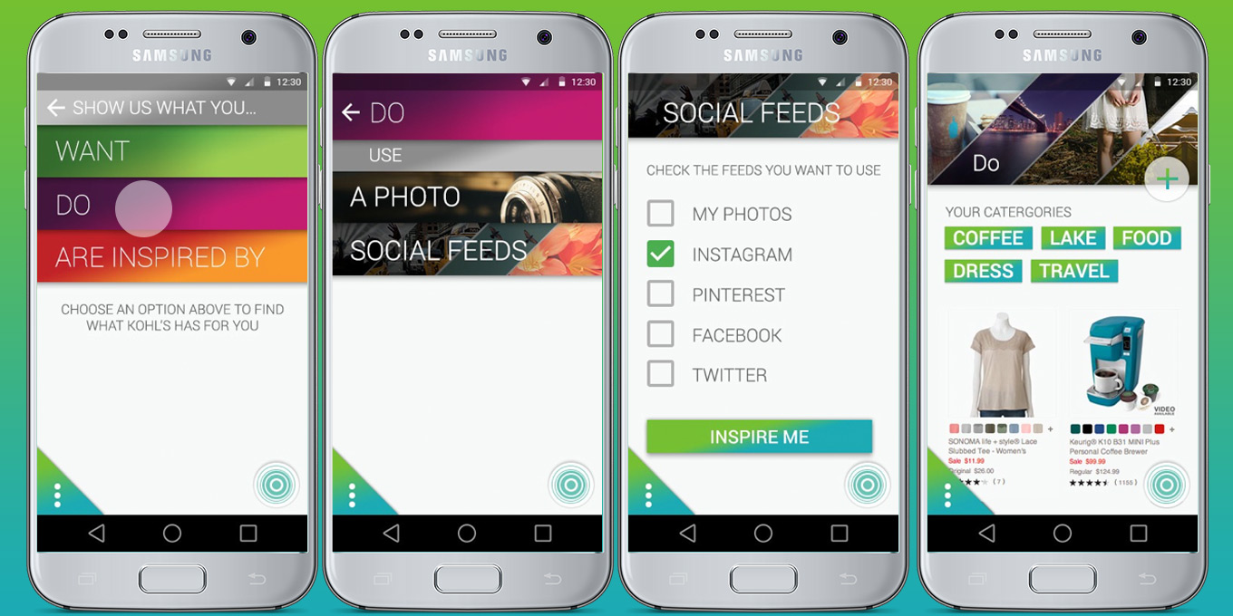
To create a more human experience, navigation labels described user motivations rather than the actions taken to satisfy them. Rather than ‘Take photo,’ we asked users to ‘Tell us what they… want/do/are inspired by.’ This allowed the Kohl’s to engage with customers in a conversational and personal manner.
A Different App for Every User
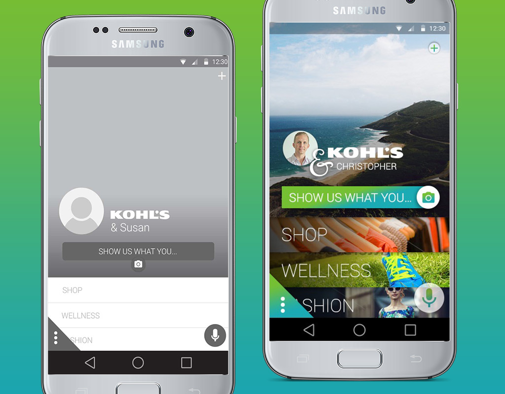
We also found that social feeds could give the application a more accurate and robust understanding of user interests. This was an opportunity to further reduce friction by restructuring the catalog within the app to better reflect the user’s interests. Better featuring products users were interested in, while pressing less relevant products into the background, meant that users could more effectively navigate the catalog.
In-app behavior would also reinforce the app’s personalization. As users interacted with certain lifestyle categories more or less, the app’s catalog would respond to feature those categories, lines, or products on the opening screen. The result was an app experience that, after use, would be different and more personal for any two users. One user could open up an app largely featuring fitness while another might have an app that brought baby and children’s clothes to the forefront.
Keeping Users Oriented with Motion Design
As we designed the app’s experience, drew from Material Design’s principles of motion and interaction to tie cause and effect together — an interaction would “grow” from the point of contact so that the system’s response was clearly communicated to the user.
The catalog, its categories, the image recognition feature and its results had the potential for very complex navigation. To make sure the user never lost their sense of place, modals and screen to screen transitions also grew or shrank from the interaction point to maintain orientation. A principle for interactions was that a user always knows where they were, how it related to where they just came from, and what they did to get there.
The movement designed into interactions served to not only keep users anchored but to give the app life and character.
I can’t go into further detail about this project publicly, but we can still talk about it.